
Industry: Urban Development, Government & Nonprofit
Hacienda Community Development: A Website Built for Access
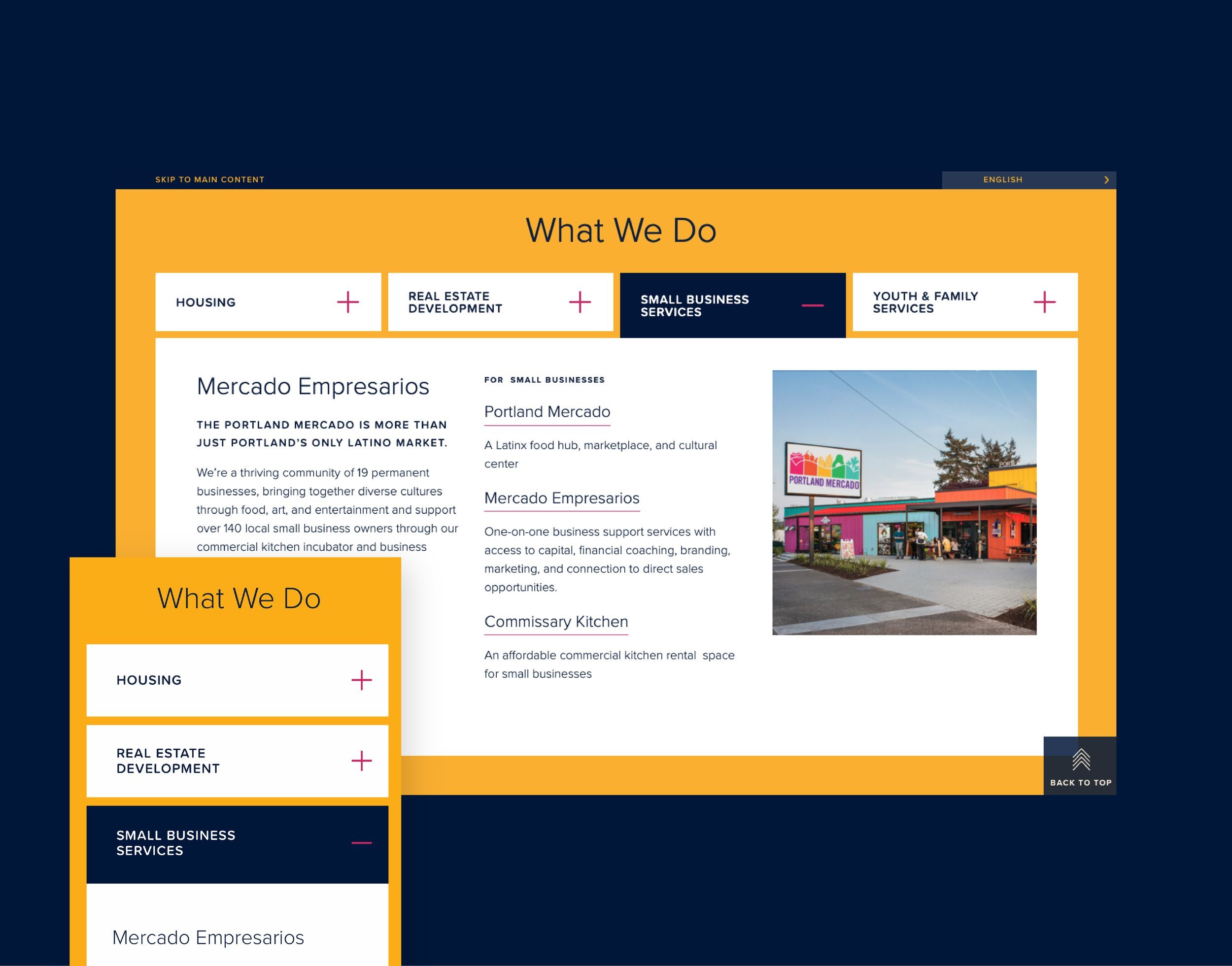
With keen attention on improved accessibility and ease-of-use for all, we worked with Hacienda’s leadership team to design a website that puts community first. The site hierarchy and navigation is designed from the user perspective, bringing clarity and greater access to services and resources.
With a focus on accessibility, ease of use, and bilingual communication, we created a digital experience that reflects Hacienda’s spirit — neighborly, inclusive, and full of life.
Services
Visual Brand Expansion
UX/UI Strategy
Website Design
Website Development
AA-level Accessibility Compliance

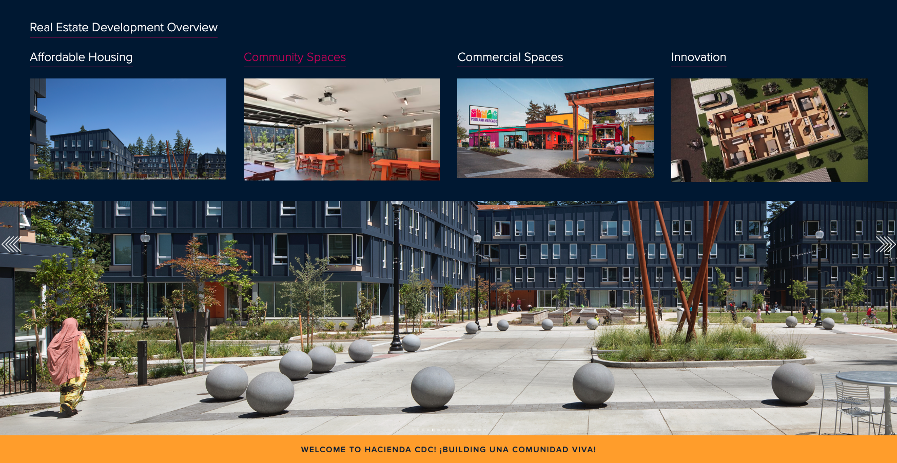
Immersive photography and an expanded color palette infuse the site with vibrancy and warmth, while maintaining strong alignment with Hacienda’s brand identity. Informational content is prioritized for both English- and Spanish-speaking audiences, ensuring that essential services remain visible and approachable.
Descriptive page titles, intuitive user journeys, and a color-coded wayfinding system improve navigation and understanding for all visitors. UI features were designed to foster inclusivity and readability, allowing color, type, and motion to function not only as design elements but as accessibility tools.


The result is a bilingual digital hub that embodies Hacienda’s mission of Una Comunidad Viva — a living community where everyone belongs. The redesigned site increased time-on-page and engagement across key resources, expanding access and strengthening the connection between Hacienda and the people it serves.
Related Case Studies:


Establishing a new standard of uncompromised accessibility for Disability Rights Oregon with an updated, inclusive brand and feature-rich ADA-compliant website.