Industry: Government & Public Service
The Port of Portland:
Move with Purpose
Our team partnered with the Port of Portland to bring its brand to life and visually convey the Port’s true vibrancy, reliability, and role in regional prosperity.

Public perception had long defined the Port of Portland by its transactional, commodity-focused assets—rendering it undifferentiated from other ports nationwide. We helped to translate their strategic framework into a visual brand that expresses aspiration, action, unity, and equity.


The new logo centers on confluence: the coming together of the Columbia and Willamette, and the tens of thousands of people who come together every day to work toward the Port’s vision of shared prosperity.
With accessibility as a guiding principle, the new brand provides clarity and ease of use for the Port’s design team, while offering the wider community a more approachable and engaging way to connect with the Port’s mission and impact.
Services
Brand and Logo Concept
Brand Design and Development
Brand Photography Strategy
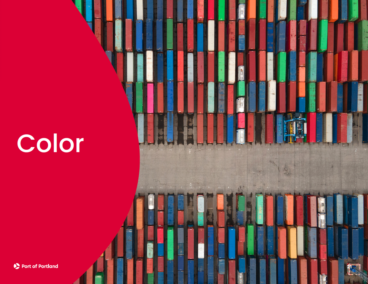
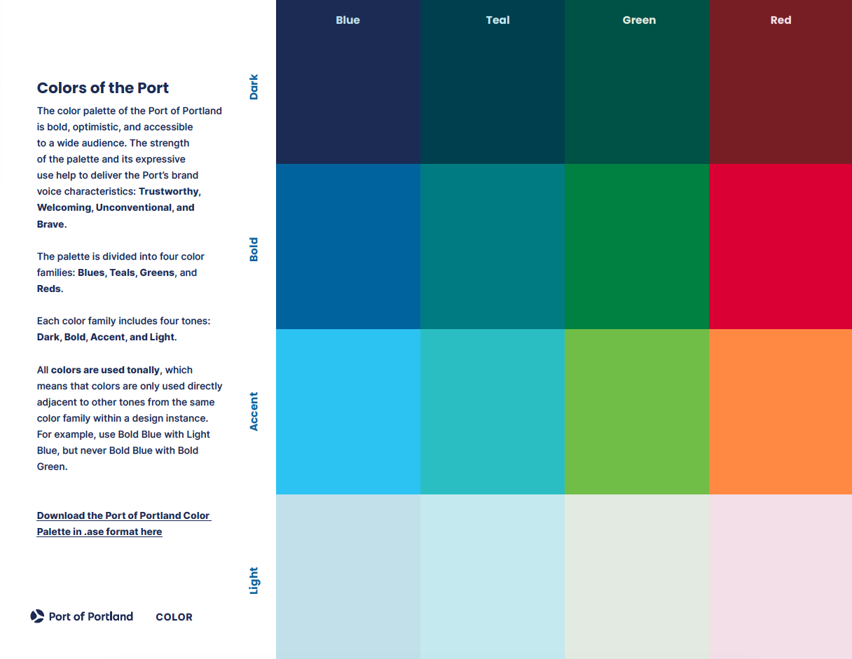
Color and Accessibility Compliance
Social Media Design
Interactive Design


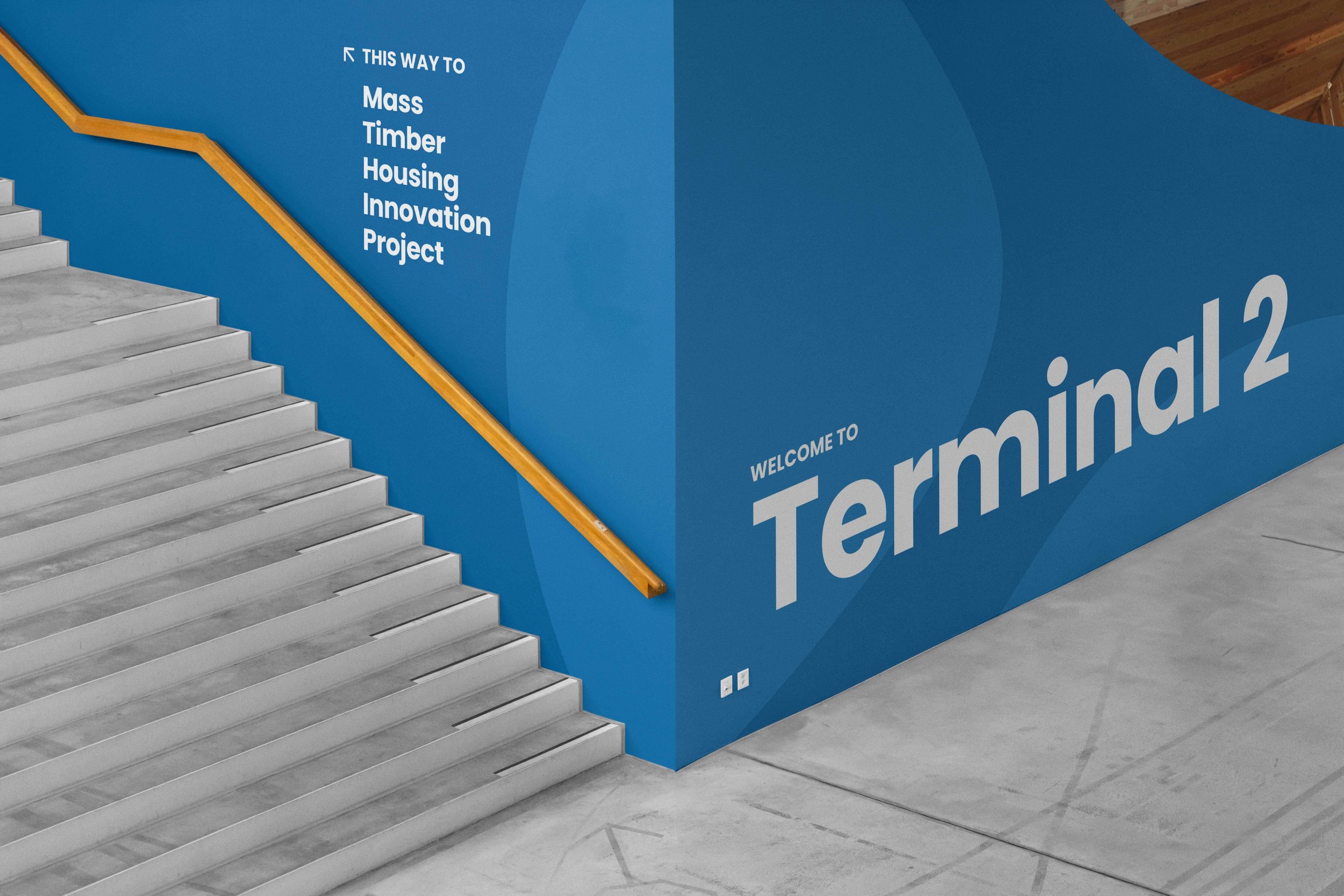
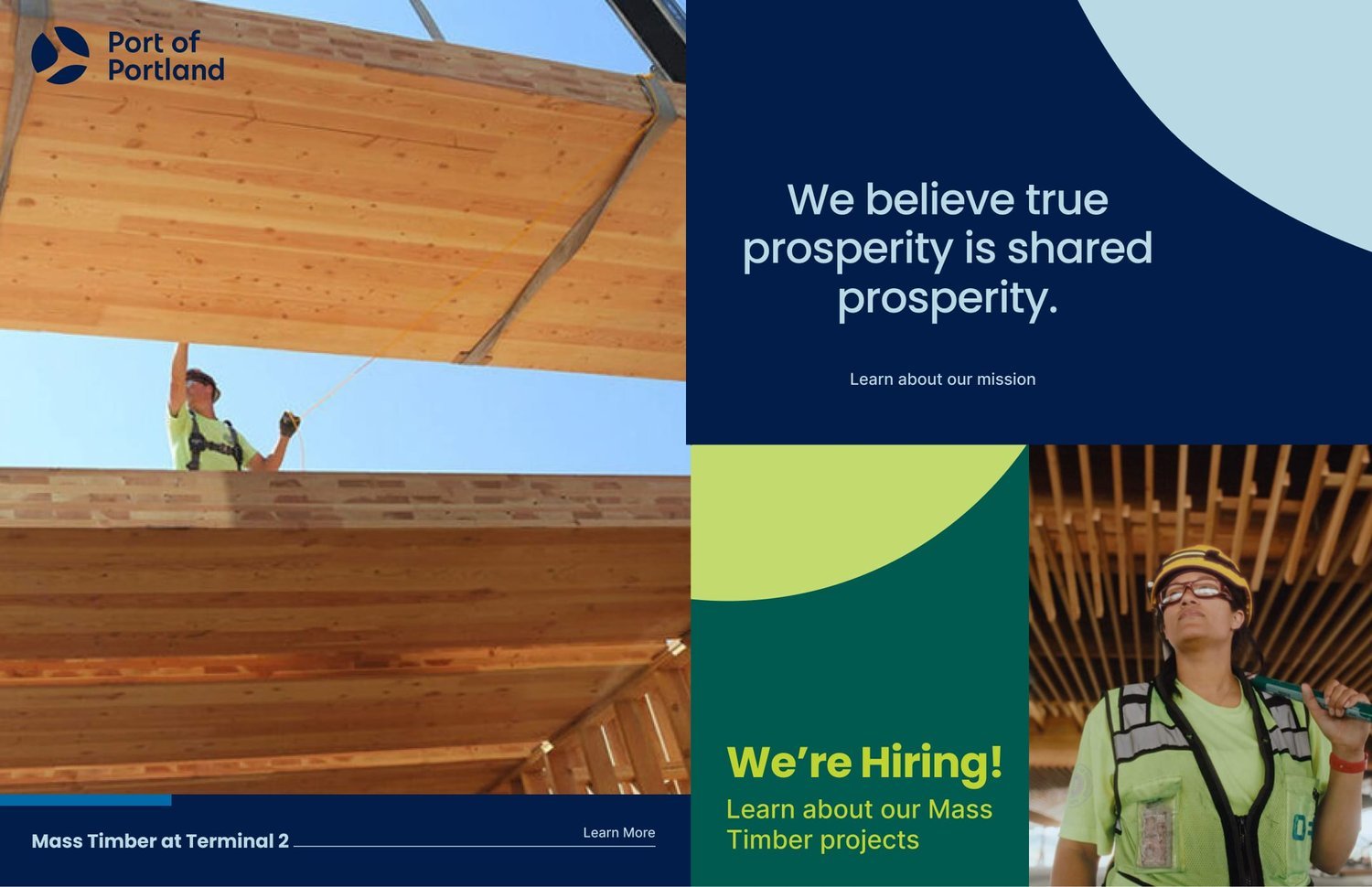


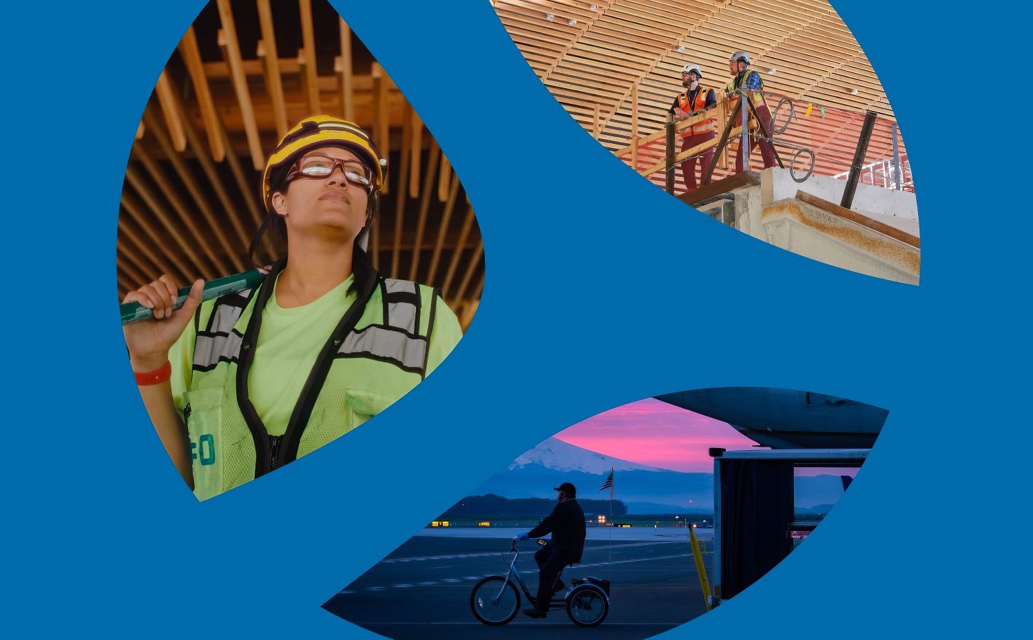
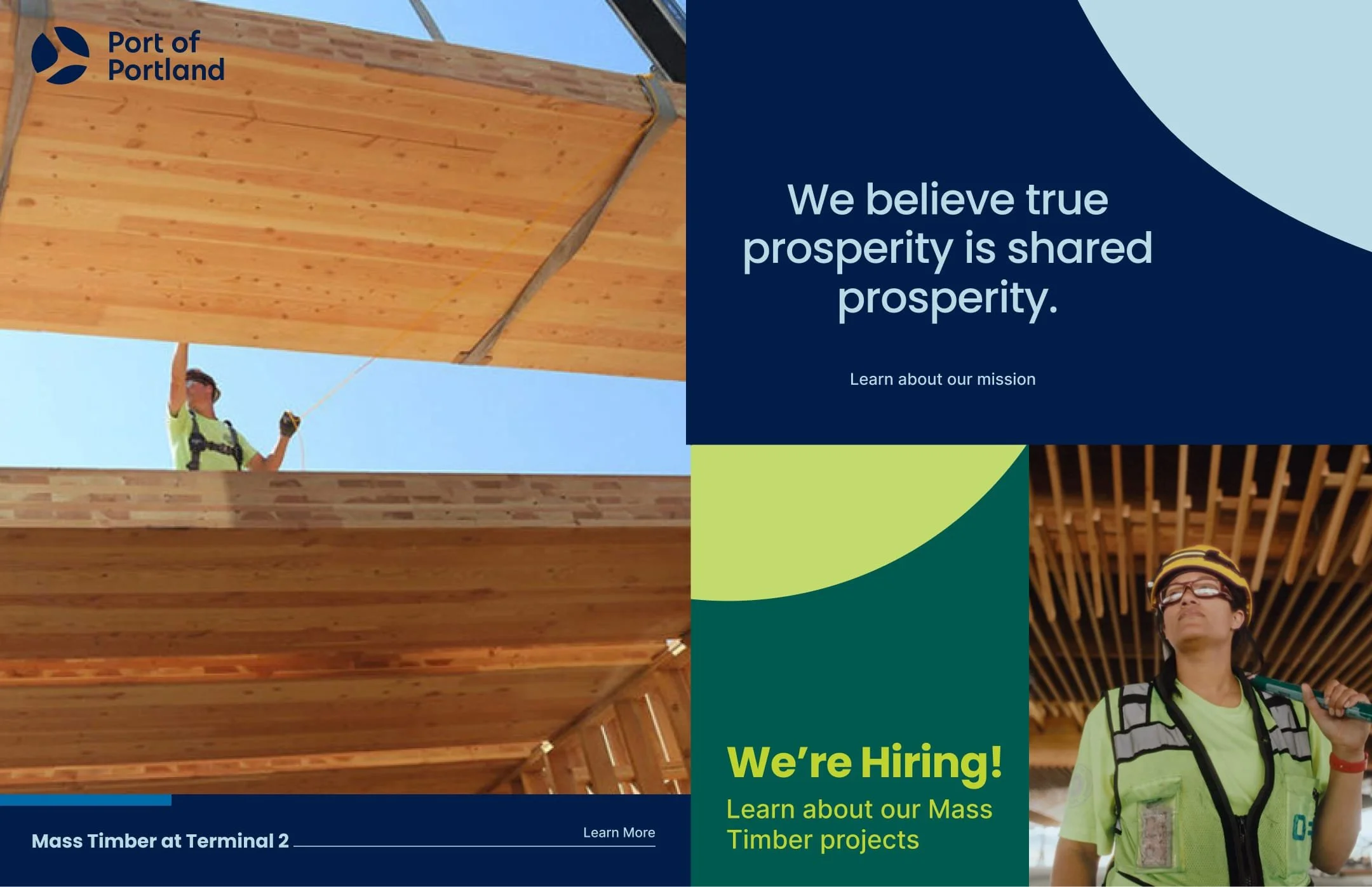
The new brand now conveys the Port’s true vibrancy and reliability, underlined by people-centered photography used generously throughout the brand’s print and digital touchpoints.
“Our brand project required stamina for complex work. TBS rose to the challenge, working collaboratively, adjusting and adapting their process to help us get where we needed to go. I’m grateful our organization had TBS by our side for this project.”
— Jen Wick, Creative Director, Port of Portland
Related Case Studies:


Establishing a new standard of uncompromised accessibility for Disability Rights Oregon with an updated, inclusive brand and feature-rich ADA-compliant website.