Hacienda Community Development:
¡Building Una Comunidad Viva!
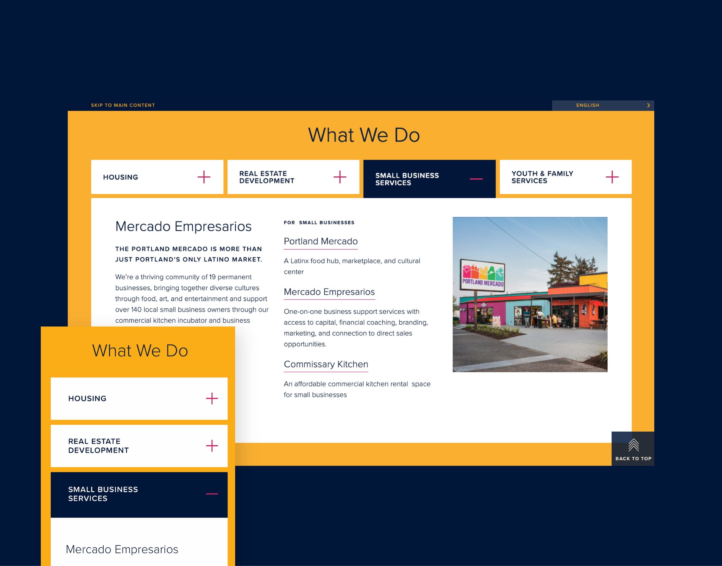
With keen attention on improved accessibility and ease-of-use for all, we worked with Hacienda’s leadership team to design a website that puts community first. The site hierarchy and navigation is designed from the user perspective, bringing clarity and greater access to services and resources.
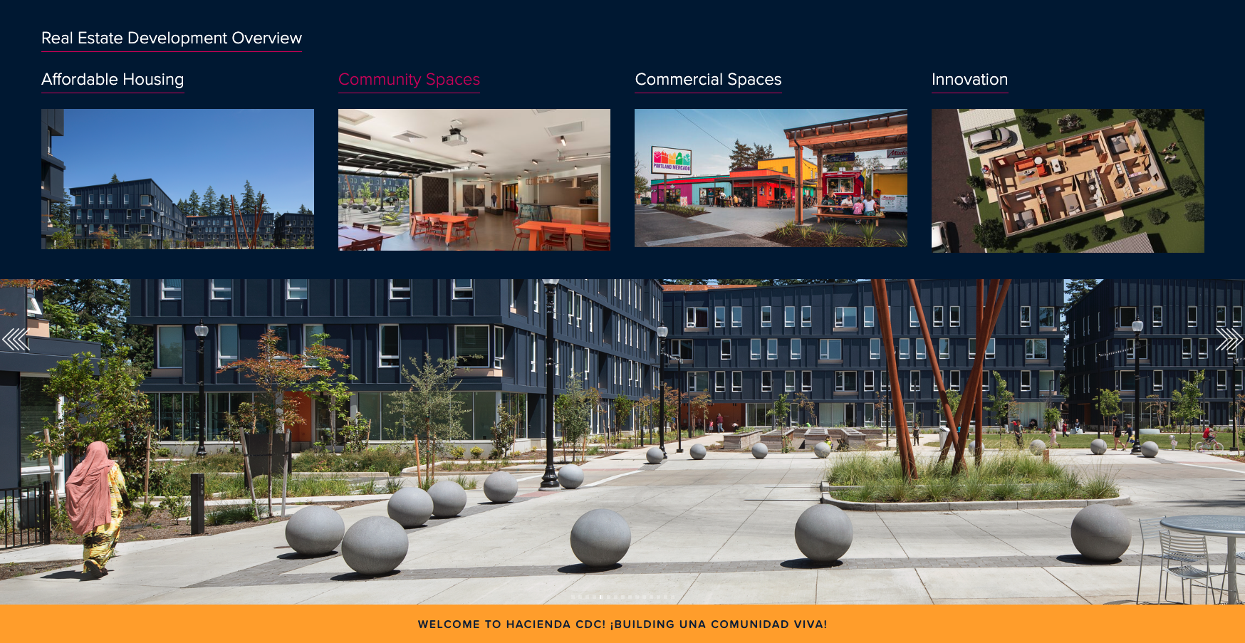
After expanding the core brand system, we focused on improving navigation and understanding for all site visitors. Descriptive page titles and a signifying color system bring clarity to site wayfinding, so users can find the services they're looking for with ease.
UI features foster inclusivity and intuitiveness, with color and graphic elements taking on the functional role of supporting sitewide accessibility as they bring the Hacienda brand personality to life with vibrancy and energy.
Immersive photography and an impactful use of Hacienda’s existing color palette combine with brand moments to express neighborly energy and vibrancy, while informational content is kept front and center for English- and Spanish-speaking audiences.