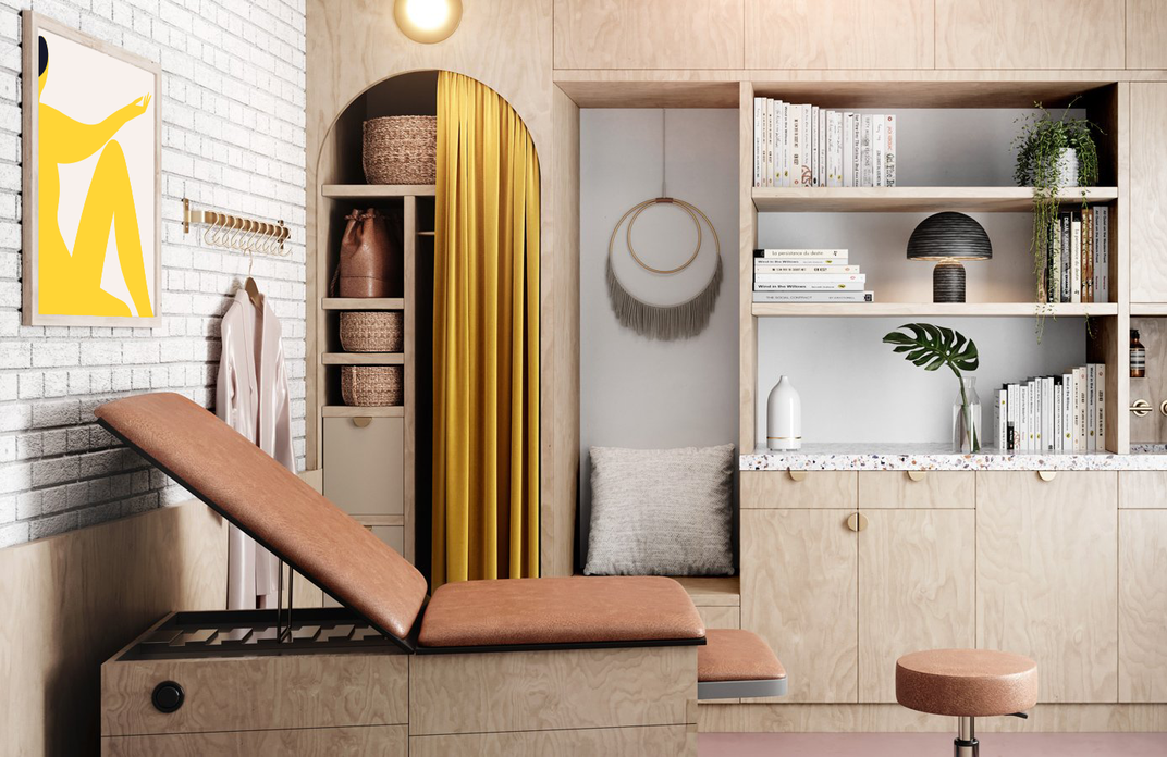
Kindbody:
A digital space for empowered fertility care
Industry: Fertility, Medical, Women’s Health
Service: Brand Identity, Messaging, UX/UI Strategy, Digital App Design, Illustration
An app experience that’s inclusive to all ages and genders—no matter where they are on their fertility journey.

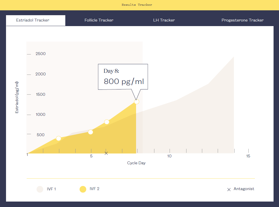
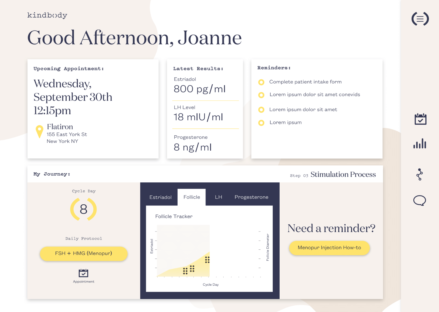
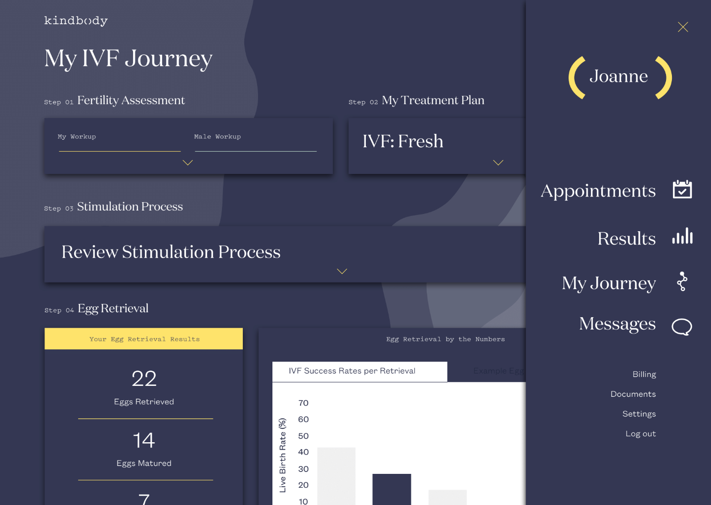
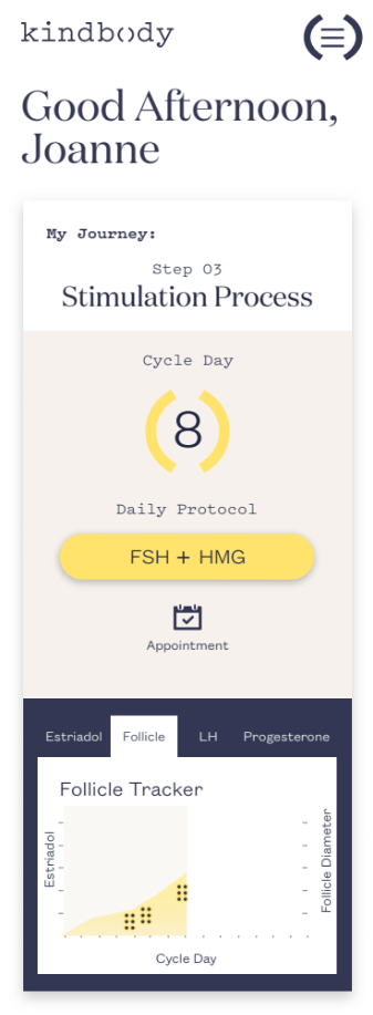
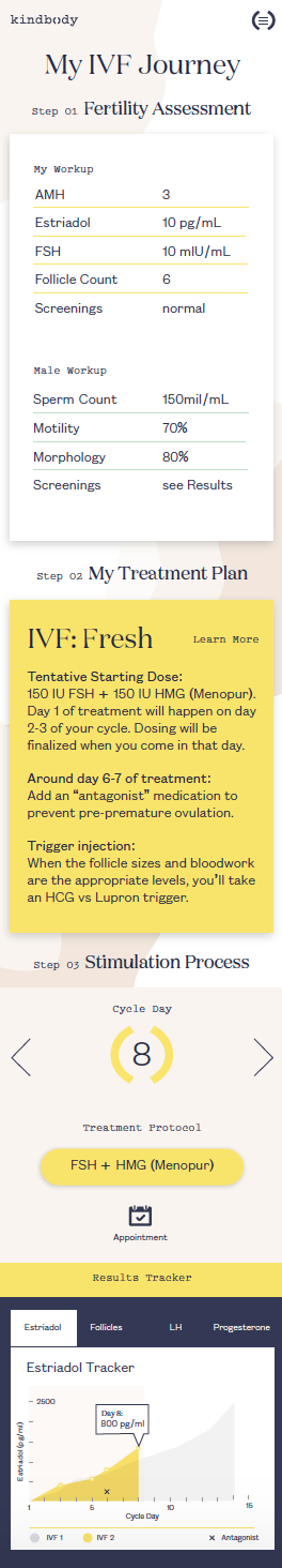
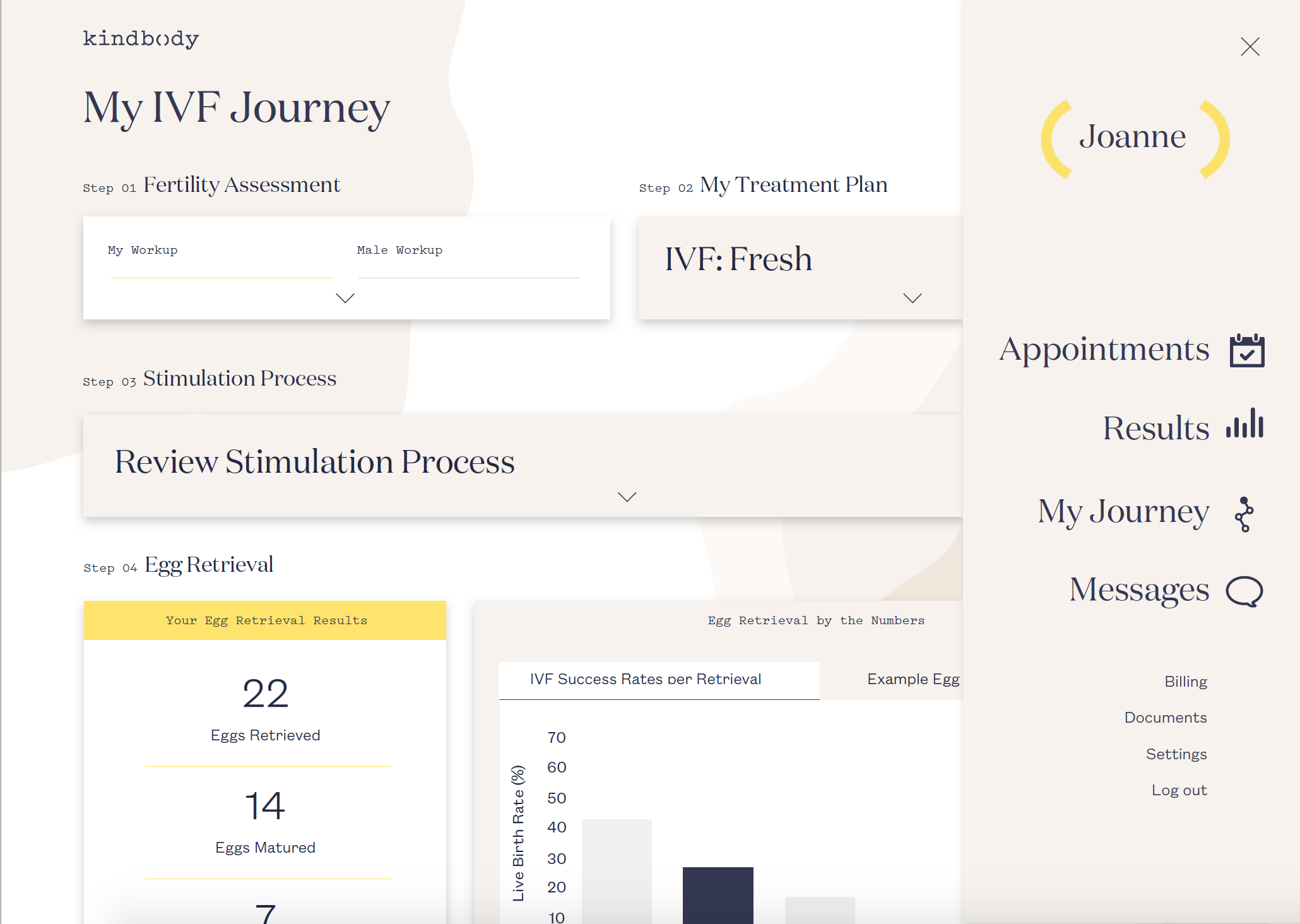
With the core brand expanded, we created a new patient portal app onboarding process. Clean and type-first interface elements float directly on the screen background. UI features foster a relaxed and comfortable mindset at any time of day, using color and graphic elements to sync with the patient’s state of being.
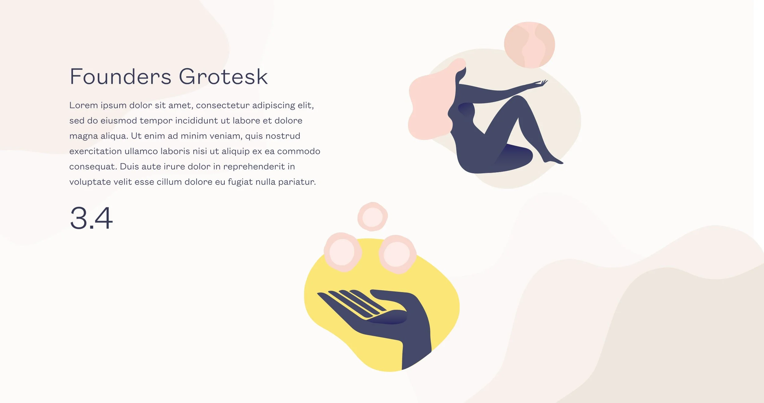
Kindbody came to us with their primary brand components already defined, but their typography, color palette, and icon system in need of expansion. We worked to expand their brand typography system, develop a set of icons and illustrations, and establish an app user experience that’s inclusive to all ages and genders—no matter where they are on their fertility journey.


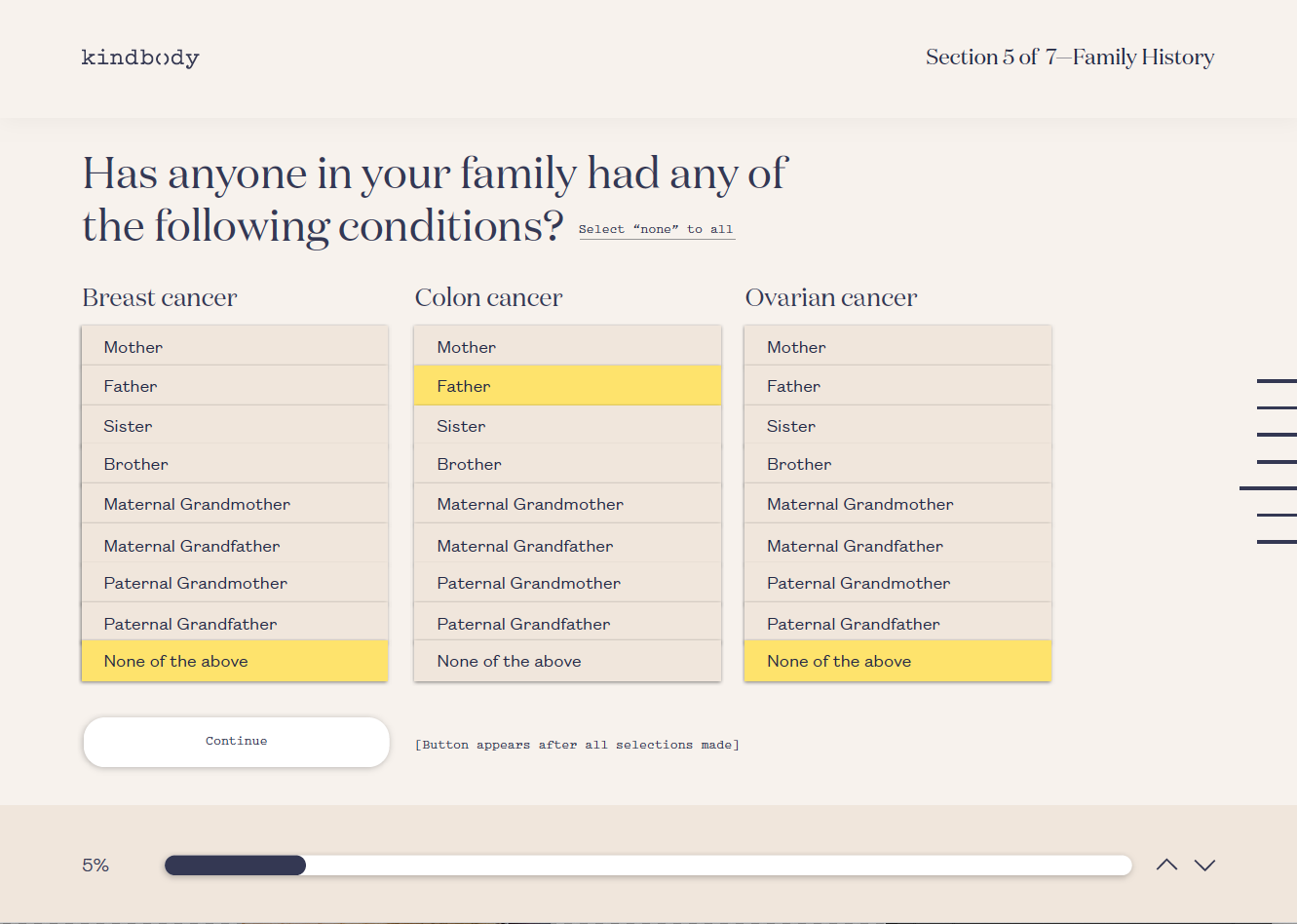
One-question-at-a-time intake forms create a stress-free onboarding experience. Friendly icons and simple animations gracefully punctuate the process and make the interface relatable. Touchpoints along the way encourage progress and orient the user in the process. Once the initial intake form has been completed, a patient never needs to enter the same information again.