Industry: Restaurant & Hospitality
Photos courtesy of Jeffrey Rivkin
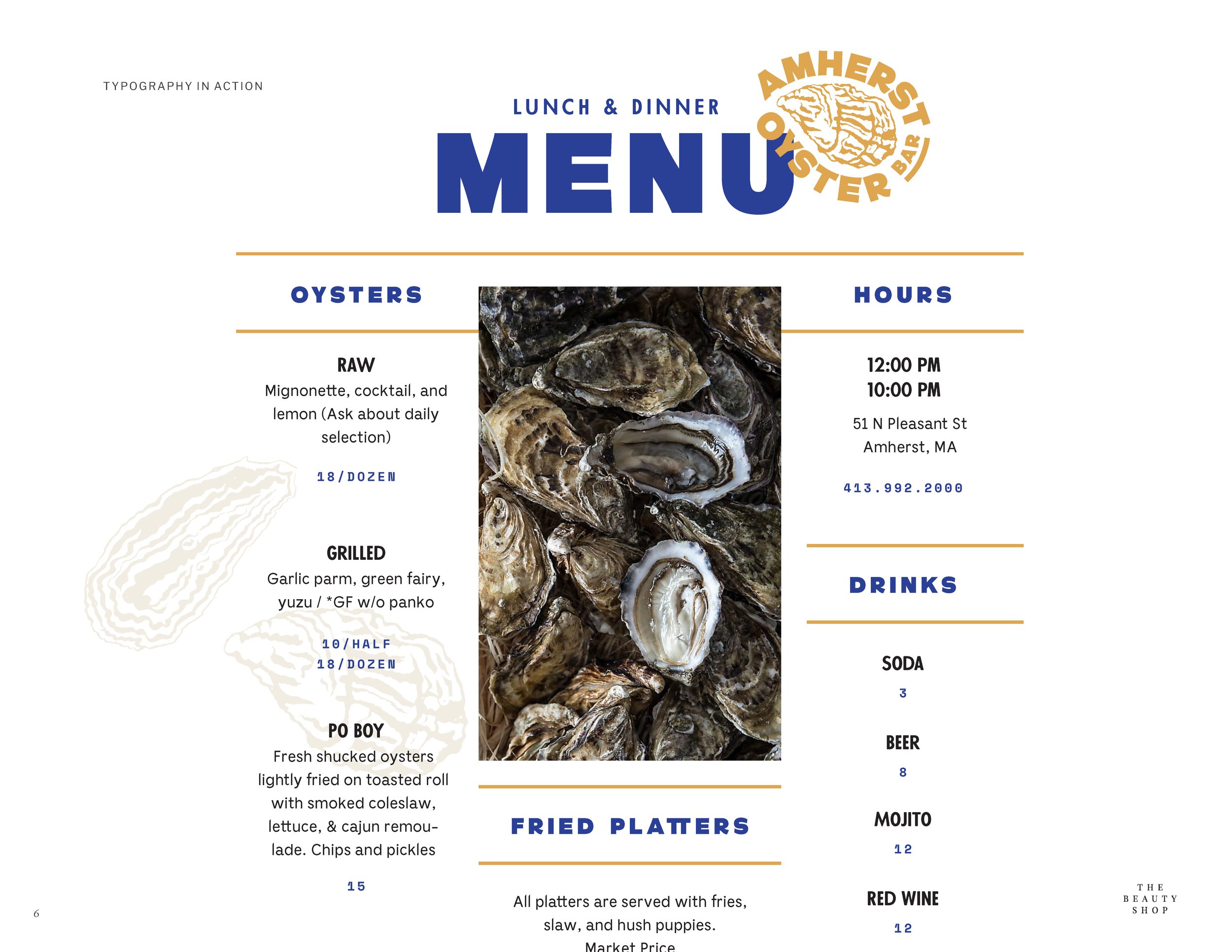
Amherst Oyster Bar:
Fresh, Salty, Briny, Local.
Honoring classic East Coast seafood, our brand for Amherst Oyster Bar celebrates the lore of the oyster po’ boy and lobster roll with fresh new energy.
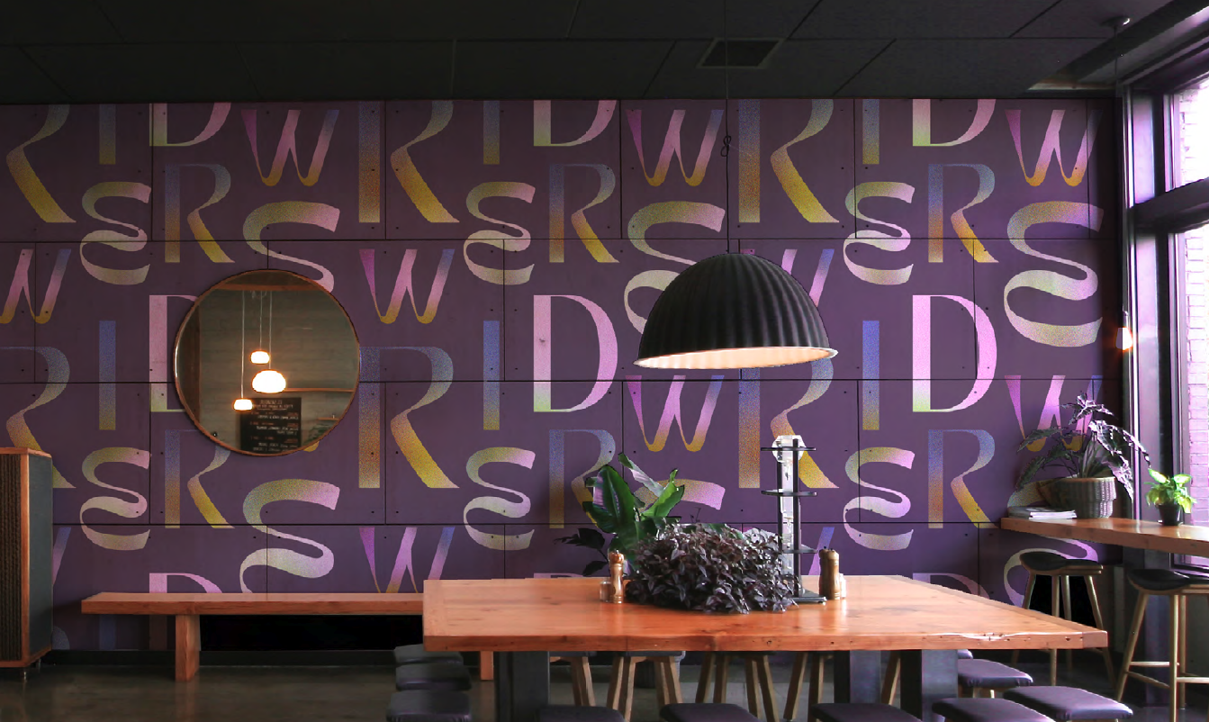
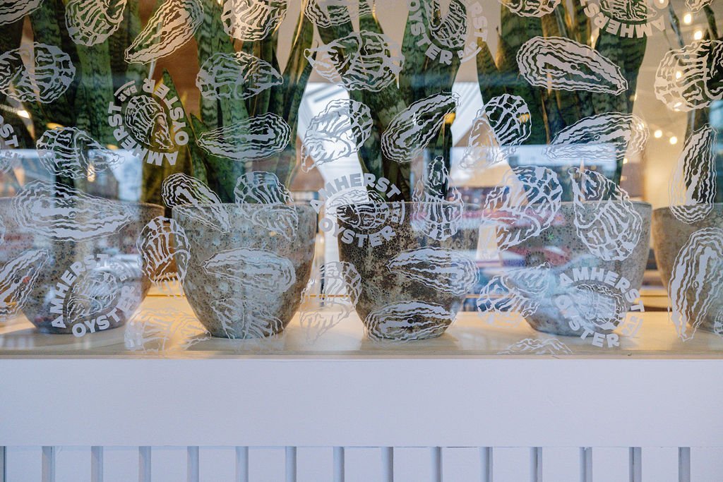
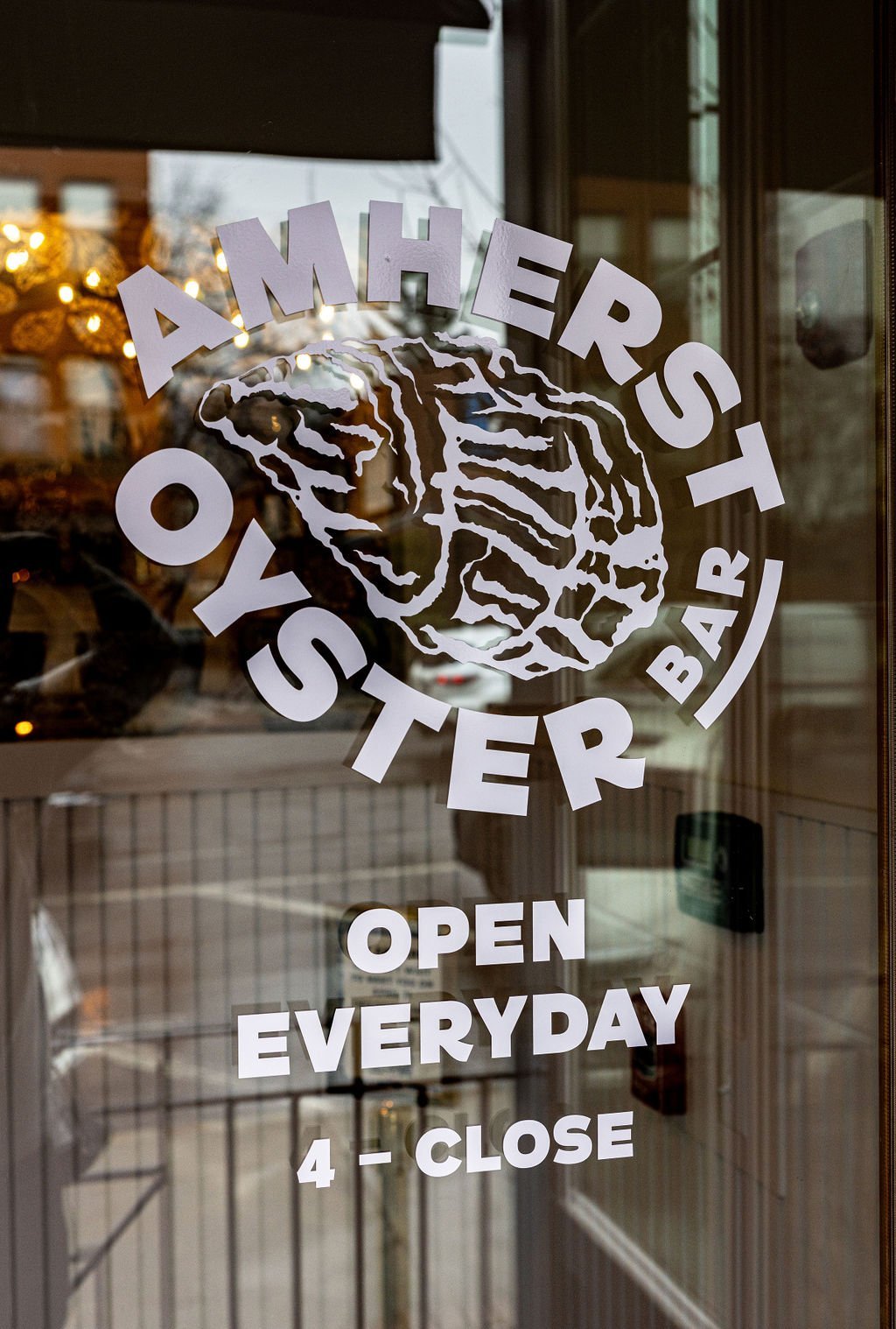
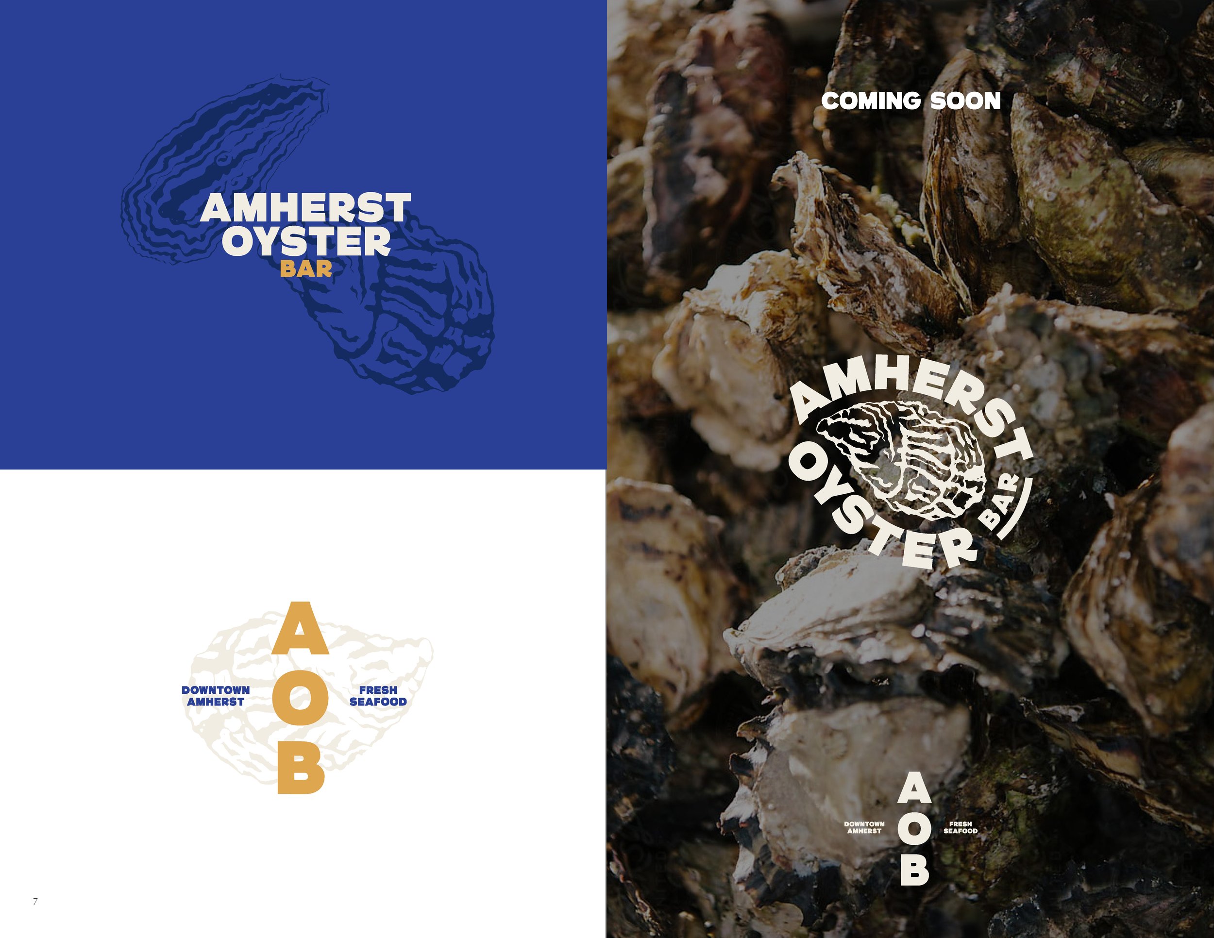
From its maritime palette to its hand-drawn details, the Amherst Oyster Bar identity evokes the nostalgia of coastal New England. We paired friendly, approachable type with illustration and pattern work inspired by fishing trawlers, menus, and seaside signage.

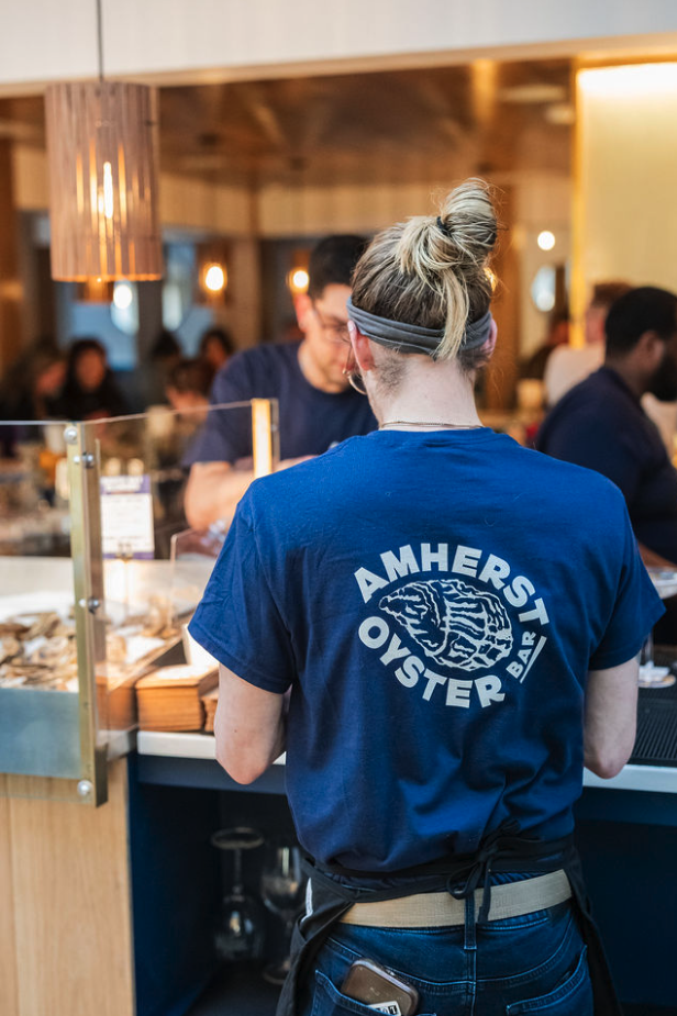
Every element , from menus and signage to environmental graphics and merchandise, was designed to tell the restaurant’s story through texture, color, and personality. Ribbons of type and illustration weave through applications, reinforcing the lighthearted energy that defines the AOB dining experience.


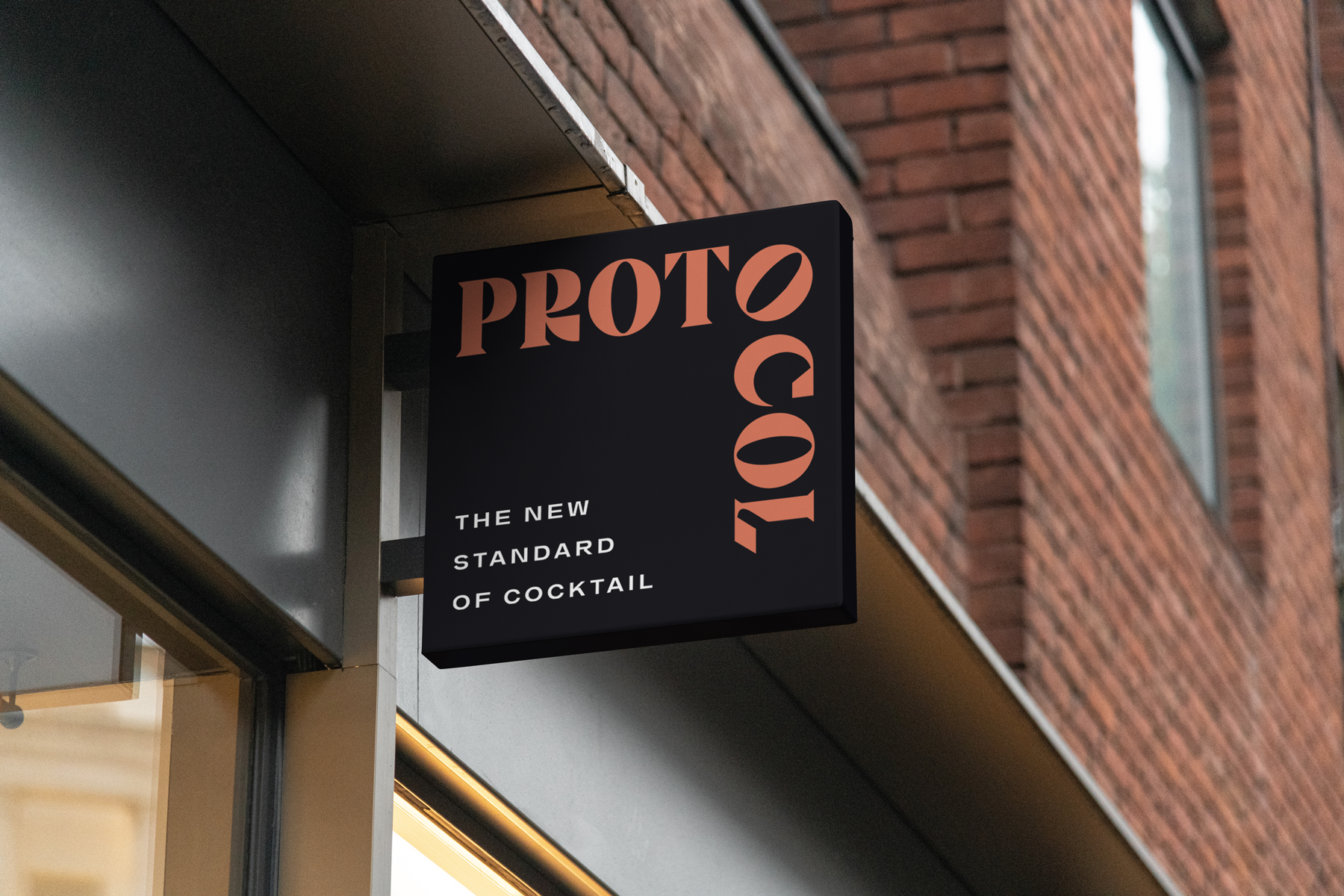
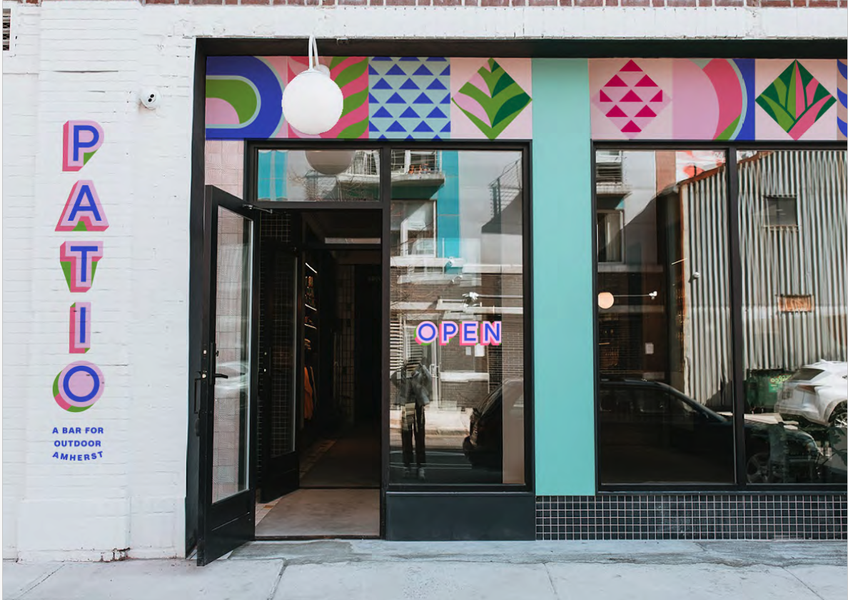
Services
Visual Brand Identity System
Signage Design
Menu Design
Messaging
Environment Design
Merch Design
This project continues our decade-long collaboration with Archipelago Investments, whose restaurant and residential developments have helped transform Amherst into a more connected, vibrant downtown.


Related Case Studies:
Case Studies Landing